


Open to new opportunities · Barcelona, ES
Senior Product Designer (UX/UI) & Lead Digital Experience Designer with 9+ years building digital products for globally recognised performance brands across European markets.
Selected work
Four projects. Four different kinds of hard.
A virtual outfit builder for a premium fashion retailer — from blank brief to full concept. Integrates body personalisation, smart sizing logic, and retention-driven saved looks. The core design challenge: rich personalisation without killing onboarding.
High return rates in a Revelyst brand revealed a deeper UX failure in how customers understood sizing. Led full research and redesign. Pending launch with strong expectations to meaningfully reduce returns.
How a campaign actually ships — from concept to twelve markets. A cookie-triggered personalisation system built on Salesforce that drives 10–15× newsletter signup uplift, with separate user paths, country-specific legal variations, and a full asset delivery pipeline.
End-to-end design and platform ownership for Fox Racing, Bell, Giro, and CamelBak across European markets — from UX to localisation to EU/US team alignment.
About
I'm a Senior Product Designer (UX/UI) and Lead Digital Experience Designer operating at the intersection of UX, product thinking, and eCommerce platform ownership. Since 2017 I've been the design and digital lead for four globally recognised performance sports brands under Revelyst — Fox Racing, Bell Helmets, Giro, and CamelBak — growing from a single market operation to a 12-country, 9-language EU presence.
I'm most effective when the problem is ambiguous and the stakes are real. I bring both strategic framing and hands-on execution — and I know how to align marketing, engineering, and leadership around a shared direction.
Based in Barcelona. Looking for Lead, Principal, or Design Manager roles where design has a real seat at the table.
I use AI tools — Claude, Cursor, v0, Lovable — as a regular part of my design and build workflow, from prototyping and research synthesis to shipping production work.
I'm also the company's main QA tester — validating every platform update before release across all four brands. It's how I built a close working relationship with the dev team, and how I learned to think about design not just as intent but as implementation.
Experience
Referrals
"A pivotal asset in supporting all adjacencies areas of our department — a strong contributor to newness and innovation, particularly on the UI/UX side."
Europe Senior Digital Director · Revelyst · Consistently Exceeds Expectations
"Manuel became a stabilizing force — he proactively filled gaps, maintained momentum, and helped the team navigate uncertainty without compromising delivery or quality."
Former Intern → UX/UI Web Designer · ~3 years
How I work
I've run design across 4 brands simultaneously. Process has to be real — not theoretical.
Contact
I'm open to Lead, Principal, and Manager roles — ideally at companies where design shapes the product direction, not just the interface. Based in Barcelona, open to remote or hybrid.
0-to-1 · Concept · Ecommerce
This project started with a question, not a spec: what would it look like if a premium fashion retailer let customers build a complete look — and made the whole experience feel personal rather than transactional?
I used a retailer like Massimo Dutti as the context to ground realistic constraints: a high-trust, premium positioning, a customer who knows quality but wants guidance, and a business that cares about both conversion and brand perception.
Rich personalisation experiences tend to fail at onboarding. The more information you ask for upfront — gender, height, body type, measurements, skin tone — the more friction you create before someone has seen a single product. But without that information, the experience is generic and the sizing suggestions are meaningless.
The design challenge was: how do you make the onboarding feel worth it before the user has seen the payoff?
"The onboarding isn't a gate. It's the first moment the product starts working for you."
Built in Figma. Interact with the onboarding flow, dress the model, and save your look.
Figma prototype · Built by Manuel Freire Brito
Rather than a standalone tool buried in the nav, the entry point lives on product and category pages — surfacing the "Build Your Look" CTA right when a customer is already considering an item. The intent is already there; we just extend it.
This also means the first item in the builder is pre-seeded with whatever they were looking at, which removes the blank-canvas paralysis of a standalone tool.
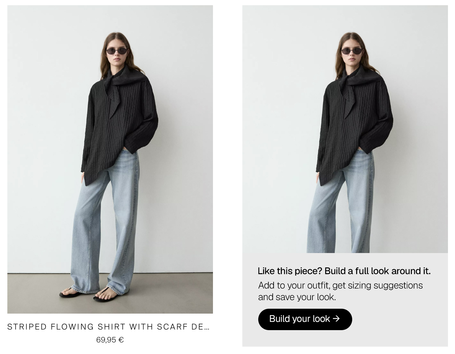
Message surfaces when hovering products in PLP and in PDP — entry is contextual, not buried in the nav.
The onboarding screen is split: the figure on the left updates in real time as the user fills in their profile on the right. This is the key design decision — the feedback is immediate, so the user sees the value of providing information as they provide it, rather than at the end.
Six data points are captured: gender, height, body type, skin tone, preferred fit, and usual size (optional). Each one has a clear visual consequence on the model — making the form feel like customisation rather than a data collection exercise.
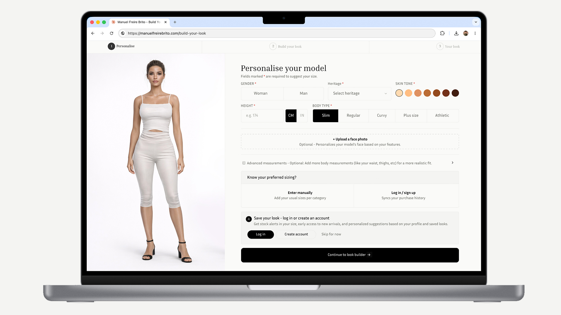
Different inputs captured to improve model preview. Model updates live as each selection is made.
Once onboarding is complete, the experience splits into two halves: the figure on the left, the product selection on the right. As the user adds items, the figure updates — making the creative decision visible before committing to purchase.
Every product is pre-tagged with the user's suggested size based on their profile. This is the payoff for the onboarding investment — the user never has to think about sizing again within the builder.
The right panel is organised into tabs — Tops, Bottoms, Shoes, Accessories. Rather than showing everything at once (which would be overwhelming), the tab structure gives the user a clear mental model and lets them complete one category before moving to the next.
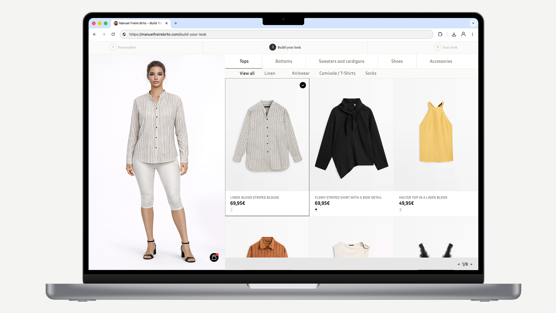
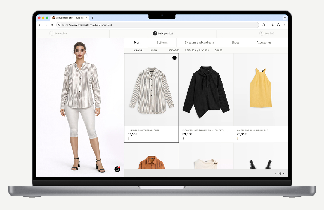
Model updates as items are added. Furthermore, every product pre-tagged with the user's size if user is logged in — no manual sizing required anywhere in the flow.
When a user saves a look — available to logged-in users, with an invitation to sign up for guests — the experience continues working for them after they leave the site. Stock notifications tied to specific items in their saved look, back-in-stock alerts for their exact size, and personalised suggestions based on their profile all become available.
This is the business case made concrete: the data the user provides to build their look feeds directly into the retention team's toolkit. The user gets value (a curated, sized wardrobe); the brand gets purchase intent data, return visit drivers, and a reason to communicate beyond generic promotional emails.
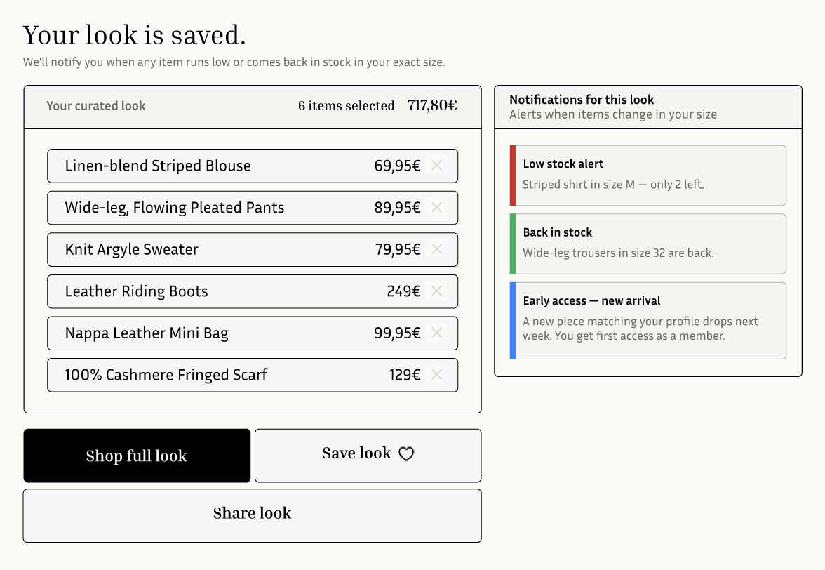
Saved looks become a retention engine — stock alerts, back-in-stock notifications, and personalised suggestions tied directly to the user's profile.
The onboarding still asks for a lot. In a real product I'd pressure-test a lighter entry path — perhaps capturing only gender and height on first use, and progressively building the profile over multiple sessions. The question is whether the size suggestion quality degrades enough to matter without the full profile.
I'd also validate the entry point placement with real session data — my assumption is that product pages are highest intent, but it's possible that category pages or the homepage generate more explorer behaviour that the tool would serve well.
Other projects
Research-led redesign · Revelyst · Ecommerce
| Helmet size | CM | Inches |
|---|---|---|
| S | 51–55 | 20 1/8 – 21 4/8 |
| M | 55–57 | 21 5/8 – 22 3/8 |
| L | 57–60 | 21 3/8 – 23 1/2 |
| XL | 60–63 | 23 1/2 – 24 5/8 |
| Cheek pad size | MM |
|---|---|
| S | 20/30 |
| M | 20/30 |
Static table. No interaction. No guidance.
| Size | CM | Inches |
|---|---|---|
| S | 51–55 | 20–21 4/8 |
| M | 55–57 | 21 5/8–22 3/8 |
| L | 57–60 | 21 3/8–23 1/2 |
| XL | 60–63 | 23 1/2–24 5/8 |
Interactive finder. Personalised result. Three tabs.
One of the Revelyst brands was seeing a persistent and growing volume of product returns — costly for the business, frustrating for customers, and quietly damaging brand perception in a category where trust is everything.
The initial brief was narrow: "fix the size chart." But the first thing I did was resist that framing and ask a more useful question — why are people returning products, and is the size chart actually the root cause?
Returns data pointed to fit as the primary reason given by customers. But "fit" is a broad category — it could mean the size chart was wrong, the product ran small, customers guessed without checking, or they checked and still couldn't make sense of the information. We needed to know which was actually happening before designing anything.
"We were asked to fix a size chart. What we actually found was a trust problem hiding behind a usability one."
I ran a combination of return reason analysis (quantitative), customer support ticket review, and moderated usability sessions watching real customers try to find their size before purchasing.
The sessions were the turning point. We watched customers land on the size chart, immediately feel overwhelmed by the measurement table, and make one of three decisions: guess based on their usual size, abandon the product entirely, or add two sizes to cart intending to return one.
First — the chart showed raw measurements with no guidance on how to take them. Customers didn't know if "chest measurement" meant relaxed or expanded. Second — there was no contextual help at the point of decision, only a buried link to a generic size guide. Third — for returning customers, there was no memory of past sizing. Every purchase started from zero.
We replaced the raw measurement table with a guided sizing flow — customers answer a few quick questions and get a personalised size recommendation. The table remains accessible but is no longer the default.
Rather than linking to a separate how-to guide, we embedded short inline instructions directly next to each measurement field — with illustrated diagrams showing exactly how to measure. This removed the biggest friction point from the existing flow.
For logged-in customers, we surfaced their previously selected size directly on the product page — "You bought a Medium in this category before. Still the right fit?" — reducing the need to repeat the sizing flow on every purchase.
| L | 57–60 | 7 1/8–7 1/2 |
| XL | 60–63 | 7 1/2��7 7/8 |
Interactive size finder with dynamic row highlighting and three states for every measurement scenario
Step-by-step instructions embedded inline — no separate page, no broken link
Size memory for logged-in users — pre-selects their last size with a confirmation nudge
The guided flow was challenged internally — the concern was that adding steps before "Add to cart" would hurt conversion. It's a legitimate concern, and I took it seriously rather than dismissing it.
I reframed the discussion around data: the existing flow was already costing conversion downstream — at the returns stage, which carries fulfilment costs, customer service overhead, and lost repurchase likelihood. A slightly longer path to the right decision is worth more than a fast path to a wrong one.
We agreed to A/B test the guided flow. This turned a blocker into a shared commitment to measuring the outcome together.
A slightly longer path to the right decision is worth more than a fast path to a wrong one.
Expected outcomes
Results to be updated post-launch. A/B test running against existing experience.
I'd have pushed for customer support ticket analysis earlier — we found rich qualitative insight there that we initially underweighted in favour of return data. The tickets revealed emotional frustration that the quantitative data didn't capture.
I'd also have involved logistics and customer service teams in the research phase, not just the stakeholder review. They had pattern recognition about return behaviour that would have accelerated the diagnosis by at least two weeks.
Other projects
Campaign · Systems · Multi-market
The Private Sale gives newsletter subscribers early access to discounts — and turns non-subscribers into subscribers by making access feel exclusive rather than promotional. The technical mechanism is a cookie triggered by the email click. The UX mechanism is two completely different site experiences, built on the same platform.
Every summer sale has the same challenge: how do you create urgency without devaluing the brand, and how do you reward loyal customers without simply discounting for everyone? The Private Sale was my answer to both questions at once.
The idea: segment visitors into two groups using Salesforce customer groups — those who have received the newsletter and those who haven't. Newsletter recipients get a cookie-triggered email link that unlocks discounts immediately. Non-subscribers see the site normally, with nudges pointing them to a sign-up form that, once completed, gives them instant access and refreshes the page in place.
The non-subscriber path turns the barrier into the value proposition. Instead of a generic newsletter pop-up, you're offering something tangible and immediate: real discounts, right now, in exchange for an email address. The form page lists the specific perks — early access, new season markdowns, Klarna, easy returns — so the conversion decision is informed rather than impulsive.
The subscriber path reinforces loyalty. The copy shifts from "get access" to "enjoy your VIP access" — a small change that acknowledges the customer's relationship with the brand rather than treating them as an acquisition target.
"The barrier is the value proposition — sign up and the discounts are yours, instantly."
A visitor who hasn't signed up lands on a completely normal site — no visible discounts, no disruption. The only signals are a thin top banner ("Access the Summer Private Sale now") and a mid-page banner placed between content sections. Both link to the sign-up page.
On the product listing page, a promotional tile sits in the product grid — same card size as a product, same visual weight — prompting sign-up. It doesn't interrupt the browsing experience; it participates in it.


A subscriber clicks the email link. The cookie fires. The site reloads — and everything is different. Prices show with strikethroughs. The homepage banner reads "Enjoy your VIP Access!" instead of "Get early access now." The PLP tile says "Shop now" instead of "Learn more."
The landing page is a dedicated Private Sale PLP — not a promotional splash screen, but a real shoppable page filtered to discounted products, with category tabs (MTB / Moto / Lifestyle for Fox; Moto / Bike for Bell) and the full product grid with sale prices visible.
The copy throughout reinforces membership: "As a member of the Fox family, you now have exclusive access..." The experience doesn't feel like a campaign — it feels like a benefit.


What looks like one campaign is actually several, running in parallel. European markets have different legal requirements around promotional periods — some countries can run the Private Sale for 8-10 days before the Summer Sale begins, others require a 2-week gap. This means some countries are in Private Sale while others have already transitioned to Summer Sale, with completely different assets per experience.
This year Fox Racing and Bell were in Private Sale while Giro and CamelBak held back stock for the Summer Sale — each requiring a different homepage, a different set of PLP tiles, and different retention email flows. All coordinated from one platform, across 12 markets, in multiple languages.
Each campaign requires five asset types delivered at least two weeks before launch: site creatives (homepage banners, PLP tiles, form page), email assets for the retention team, ad creatives for the traffic team, QA testing links for the eCommerce team to review both paths, and campaign links for the retention team to build their email flows faster.
I coordinate all five in parallel, deliver them to the relevant teams with enough lead time to absorb feedback, and run the QA process end-to-end — testing both user paths, both brands, across market and language variations before anything goes live.
Getting the Director of eCommerce approval — and getting all stakeholder feedback in time — those are the two moments where the launch either holds or doesn't.
The hardest single moment in running this campaign is getting creative sign-off from the Director of eCommerce. The window between "assets ready" and "campaign live" is tight, and the approval process involves reviewing every touchpoint — homepage, form page, PLP tiles, emails, ads — across two brands simultaneously. Any ambiguity in messaging, any misalignment between the two user paths, surfaces here.
The discipline I've built around this: make the messaging decisions before the assets go for approval, not during. Clear hierarchy between "get access" copy for non-subscribers and "VIP access" copy for subscribers — so the Director is reviewing execution, not resolving a strategic question at the last minute.
The second hard moment is getting feedback from the eCommerce team before the launch window closes. I send QA testing links at least two weeks before the go-live date — one link per path, per brand — specifically to give reviewers enough time to flag issues without creating a last-minute scramble.
The two-week buffer isn't just good practice. It's the design of the process. A campaign with this many moving parts — two brands, two user paths, twelve markets, multiple legal variations, five asset types, three stakeholder teams — only ships smoothly if the feedback loops are built into the timeline, not bolted on at the end.
What this delivers
Other projects
Systems · Leadership · Multi-market
I joined Fox Racing in 2017 as the EU design and platform lead, with five European markets already live. The first challenge was scale — not just adding countries, but understanding that each market brings a different combination of language, currency, legal requirements, content conventions, and user expectations.
Over the following years, we expanded from 5 to 12 countries, adding English, French, German, Italian, Spanish, Portuguese, Dutch, Swedish, and Danish — across four currencies (Euro, British Pound, Swedish Krona, and Danish Krone). This wasn't just localisation. It was platform architecture, content strategy, legal compliance, and UX adaptation all running in parallel, with one person coordinating the EU side of every decision.
For each new market: platform configuration in Salesforce Commerce Cloud, currency and pricing logic, language-specific content, legal page requirements (terms, accessibility statements, returns policies adapted per jurisdiction), and ensuring the UX held up across all language lengths — German and Dutch copy, for example, consistently breaks layouts designed for English.
This phase taught me the discipline that would later become the launch framework: audit first, standardise what you can, identify what must be brand or market-specific, and build for the next expansion from day one rather than refactoring later.
"The question was never just 'how do we launch this?' — it was 'how do we build something that scales the next time?'"
When Bell and Giro came on simultaneously, the first thing I did was audit the existing US sites. Not a surface-level review — a structured analysis of every content type, every page category, and its actual traffic and engagement. The goal was to make a defensible decision about what was worth migrating to EU, what needed rebuilding, and what should be cut entirely.
This matters because migrating bad content to a new market doesn't just waste time — it creates maintenance debt, dilutes the brand, and degrades SEO from day one. The audit was the moment where I pushed back on the instinct to "just bring everything over."
From the audit I built the full site maps for both Bell and Giro — defining the content structure, page hierarchy, navigation logic, and the relationship between content types before a single page was built. These became the source of truth for the entire project, used by design, development, and the US stakeholder team to align on scope.
The two brands share structural similarities but are different products in different categories — Bell is primarily helmets for cycling and moto, Giro covers cycling and snow. The content architecture had to reflect those differences while remaining maintainable by one person across both platforms.


Mid-way through the Giro launch, a product recall requirement surfaced that needed its own dedicated legal page — the Merit Helmet Voluntary Recall. This meant coordinating with the legal department to get approved copy, building and QA-ing a compliant page in both English and the relevant market languages, and ensuring it was accessible from the correct navigation paths — all while the rest of the launch was in progress.
This kind of interruption is where launches fail silently — by de-prioritising the compliance work to hit the feature deadline, or by rushing it and creating a legal liability. The call I made was to time-box the recall page as a hard dependency, not a nice-to-have, and reprioritise the content work around it. The launch held.
The harder operational challenge was context-switching between Bell and Giro simultaneously — different stakeholders, different content priorities, different brand identities, same platform, same deadline pressure. The site maps became the mechanism for keeping both tracks visible and preventing decisions made for one brand from accidentally being applied to the other.
I coordinated with the US team for technical requirements and sign-off, while owning the EU-side decisions independently. The discipline of separating what was global (platform architecture, SFCC configuration, shared legal frameworks) from what was brand-specific (content taxonomy, visual assets, page structure) is what made it manageable.
The site maps weren't just documentation — they were the alignment tool that kept four brands and two continents moving in the same direction.
CamelBak launched six months after Bell and Giro with effectively the same brief — EU launch across 7 countries (expanding to 12), audit the US site, build the content architecture, create visuals and assets, enhance PDPs based on merch priority, build the homepage, handle legal, support the retention team's flow work.
The difference was that by this point the framework was proven. The audit methodology was documented. The content architecture approach was repeatable. The platform configuration patterns were known. What took the most time on Bell and Giro — the discovery and decision-making phase — was significantly compressed for CamelBak because the questions had already been answered once.
The launch playbook that emerged across these four brands covers: US site audit methodology (content value vs traffic), content architecture and site mapping, platform configuration in SFCC, localisation workflow across 9 languages, legal page requirements by market, PDP enhancement process coordinated with the eMerch team, homepage build, retention team asset support, and the EU/US alignment cadence for technical sign-off.
It wasn't written down as a formal document — it lived in the muscle memory of having done it three times. But it was real, repeatable, and it shipped four brands to twelve markets.
What was shipped
I'd have formalised the framework earlier — after Fox, not after Bell and Giro. The audit methodology, the content architecture approach, the legal checklist by market — these existed as practice by the time CamelBak launched, but they weren't documented in a way that could be handed off to another designer or used to onboard a team. That's the gap between a solo operator and a genuine lead: the ability to systematise your own process so it outlasts you.
I'd also have pushed for a shared design system across the Revelyst brands from the beginning. Each brand has its own visual identity — which is right — but the underlying component library, the SFCC template patterns, the content modules — these could have been shared infrastructure. The time spent rebuilding equivalent components four times is time that could have been invested in better UX decisions per brand.
Other projects
Manuel Freire Brito · Senior Product Designer (UX/UI) & Lead Digital Experience Designer · Barcelona, ES
↓ Download PDFPerformance review and recommendation letter available. Additional NDA-protected work can be shared on a call upon request.
Performance review · 2025 · Revelyst
"Completely self-managed, delivers timely and accurate work results. Serves as a subject matter expert, mentor and resource for team members. Strong ability to communicate at all levels."
Campaign system · Fox Racing & Bell Helmets · Ongoing
Every summer we run a major sale event. The challenge: how do you drive newsletter signups, reward existing subscribers, create pre-sale urgency, and comply with different legal windows across 12 countries — all at once, without building 12 separate campaigns?
The answer was a Private Sale that runs in the week or two before the public Summer Sale. Subscribers get early access to discounts. Non-subscribers see the site normally — but get nudged at every touchpoint to sign up and unlock access. Once they do, the experience changes immediately.
I conceived the system, built it on Salesforce Commerce Cloud using customer groups and cookie-triggered personalisation, and have run it every year since. It works.
Every visitor lands in one of two experiences, determined by a single condition: are they a newsletter subscriber? The Salesforce customer group handles the logic. The cookie handles the session. The design handles everything the user actually sees.
"The barrier is the value proposition — sign up and the discounts are yours, instantly."
The site looks completely normal. No discounts visible. But a thin banner, a mid-page strip, and a PLP tile all say the same thing: there's a Private Sale, and you can access it. Every touchpoint leads to the same form page.


Newsletter subscribers receive an email with a link that triggers a cookie. From that moment the site shifts: discounts are visible across the catalogue, the banners change tone, and the PLP tile says "Enjoy your VIP Access!" instead of "Get early access now!"
That copy shift is deliberate. The language moves from urgency and acquisition to belonging and reward. You're no longer being nudged — you're being welcomed.


The Private Sale runs 8–10 days in most countries. But several markets have legal restrictions that require a full 2-week gap before running a sale — meaning some countries are in Private Sale while others have already transitioned to Summer Sale. Two completely different asset sets, live simultaneously, managed per country.
Each campaign requires five asset types delivered at least two weeks before launch: site creatives, email assets for the retention team, ad creatives for the traffic team, all campaign links for the retention team to build their email flows, and QA testing links for the eCommerce team to review both paths. I coordinate all five in parallel, across two brands.
What this delivers
The hardest single moment is getting creative sign-off from the Director of eCommerce. The window between "assets ready" and "campaign live" is tight, and the approval process involves reviewing every touchpoint — homepage, form page, PLP tiles, emails, ads — across two brands simultaneously. I've learned to present the logic of the system first, then the creative. When the Director understands why decisions were made, approvals are faster and feedback is more precise.
Feedback that arrives late doesn't just slow things down — it compresses every downstream dependency: eMerch promo setup, QA, retention email build, ad trafficking. The two-week lead time isn't padding. It's the mechanism that keeps feedback from becoming a crisis. A launch that ships clean is always better than one that ships fast.
Other projects
Recommendation letter · Character & leadership
This letter was written unsolicited by a former intern I mentored over nearly three years. He grew from intern to UX/UI Web Designer during our time working together — which is context I think matters when reading what he wrote.
Full letter
To whom it may concern,
I'm writing to strongly recommend Manuel, with whom I worked closely for nearly three years in a highly collaborative, cross-functional product environment. During that time, Manuel was first my manager and later my senior colleague, though his impact on the team consistently went far beyond any formal role or title.
Manuel played a key role in holding complex projects together, acting as a central point between design, engineering and stakeholders. He brought clarity to ambiguous problems, structured workflows where none existed, and ensured that product decisions were aligned with both technical constraints and user needs. His ability to balance strategic thinking with hands-on execution made him an essential part of the team's success.
When organizational changes introduced new leadership, Manuel became a stabilizing force within the product team. He proactively filled gaps, maintained momentum, and helped the team navigate uncertainty without compromising delivery or quality. Much of what the team was able to ship during that period was the result of his ownership, reliability and calm leadership.
Manuel is a Senior Product Designer with strong technical understanding, but what truly sets him apart is his systems thinking and collaborative mindset. He is equally comfortable leading initiatives end to end or supporting others, always prioritizing the success of the product and the team. His work consistently brought structure, accountability and thoughtful decision-making to complex product challenges.
I would recommend Manuel without hesitation to any product-focused organization looking for a designer who combines strong UX skills with ownership, maturity and the ability to work effectively across disciplines.
I'm happy to provide further information via call or email upon request.
Former Intern → UX/UI Web Designer
Worked with Manuel for ~3 years · Cross-functional product team
Additional references available on request
Get in touch